The Latest in CSS
Last updated: 2020-08-26
min()Functionmax()Functionclamp()Functionlight-levelinverted-colorsprefers-color-schemeprefers-contrastprefers-reduced-motionprefers-reduced-transparencyprefers-reduced-data- Custom media queries
- Content-visibility
Will-changeproperty- Reducing the Render-blocking time
- Avoiding
@importto include multiple stylesheets - References
`min()` Function
The min() function contains one or more comma-separated calculations and represents the smallest value of them. We use the min() to set a maximum value.
Consider the following example. We want the element to have a maximum width of 500px.
width: min(50%, 500px)
The browser has to choose the smallest of the values (50%, 500px). Choosing that depends on the viewport width. If 50% computes to a value more than 500px, then it will be ignored and 500px will be used instead.
Otherwise, if the 50% computes to a value less than 500px, then the 50% will be used as a value for the width. Can you guess the viewport width that will make that happen? (The 50% of X = 500px). The viewport width is 1000px.
`max()` Function
The max() function contains one or more comma-separated calculations and represents the largest value of them. We use the max() to set a minimum value.
Consider the following example. We want the element to have a minimum width of 300px.
width: max(50%, 300px)
The browser has to choose the largest of the values (50%, 300px). Choosing that depends on the viewport width. If 50% computes to a value less than 300px, then it will be ignored and 300px will be used.
Otherwise, if the 50% computes to a value more than 300px, then the 50% will be used as a value for the width. It’s the opposite of min() function.
`clamp()` Function
What clamp() do is that it clamps a value between two defined values, minimum and maximum. It takes three parameters (min value, preferred value, max value).
Consider the following example.
width: clamp(200px, 50%, 1000px)
We have an element with a minimum width of 200px, a preferred value of 50%, and a maximum value of 1000px. Let’s visualize that!
Here is a recap for the example above:
- The width will never go below
200px - The central (preferred) value is
50%and will only work if the viewport width is greater than 400px and less than 2000px. - The width won’t go above
1000px
The clamp() is similar to the physical tool we have. It clamps a value based on two provided values at the edges (min, max).
`light-level`
This feature isn’t available in any browsers at the time of writing, but it definitely sounds like a future favorite. With the light-level media query, you can tune your styles based on whether your user is viewing your web app outside in daylight, or perhaps checking in before going to bed. This is great news for anyone who has ever tried to read their phone in the park, or check out a website at night!
There are three available values – dim, normal (the default), and washed. Here’s an example where we change some CSS custom properties:
@media (light-level: dim) {
  :root {
    --text-color: white;
    --background-color: black;
  }
}
`inverted-colors`
Before the time of dark mode, a lot of people turned on the “invert colors” to get that “dark mode” feel. It looked pretty neat, but it also screwed with images, text shadows, and the way fonts were rendered (white on black has more perceived contrast than black on white for some reason).

The inverted-colors media query lets you adapt around those quirks! Although currently supported in Safari (and Safari on iOS), I sure hope this lands as well.
This is a boolean option, with two values none and inverted. But you can just skip the value altogether and write something like this:
@media (inverted-colors) {
  img {
    filter: invert(1);
  }
  * {
    box-shadow: none !important;
    text-shadow: none !important;
  }
}
`prefers-color-scheme`
You might actually have heard about the prefers-color-scheme media query already. This one lets you react to whether the user has turned on so-called “dark mode” on their device. In other words – adding “dark mode” to your app is now a few lines of code!
This feature is already widely supported in browsers, and has three possible values – light, dark, and no-preference. Here’s an example where we change the background color of the site based on preference:
@media (prefers-color-scheme: dark) {
  body {
    background: #1e1e1e;
    color: white;
  }
}
`prefers-contrast`
The prefers-contrast media query lets you cater to users who prefer high contrast content compared to your original design.
There’s two values here – no-preference and high. There’s some discussion in the draft document about splitting high into increased and extremely-high, but nothing is certain yet. That’s probably the reason why there’s no support for this one yet. But when they decide, you’ll know what to write!
@media (prefers-contrast) {
  :root {
    --text-color: black;
  }
}
`prefers-reduced-motion`
Some users aren’t fans of animations and transitions. To some unlucky few, these kinds of movements can make them physically sick! That’s why most devices now support a way to tune down the transitions you find in most modern UIs.
With the prefers-reduced-motion media query, you can respect that wish as well. Use it to reduce those “bouncy” animations, fading images and “fun” transitions a bit. Note that you don’t necessarily have to remove all movement, but reduce it.
Browser support for this one is pretty good already, and is a “boolean” value too – no-preference or reduce. Here’s an example:
@media (prefers-reduced-motion) {
  * {
    transition-duration: 0.05s;
  }
}
`prefers-reduced-transparency`
Some operating systems offer an option to reduce the amount of translucent layering effects used by the system. Although not supported by any browsers yet, the prefers-reduced-transparency media query is aiming to help you cater to those users.
This is another boolean value – no-preference and reduce, so when it does get shipped in some browsers, you can write code like this:
@media (prefers-reduced-transparency) {
  .floating-box {
    opacity: 1;
  }
}
`prefers-reduced-data`
Now this one is pretty exciting. If you’re running low on cellular data, or if you’re traveling internationally, it sucks to hit an image-heavy site. Well, not anymore, thanks to the fabulous prefers-reduced-data media query!
There’s no support for this yet, but it’s one of the most practical applications of media queries I’ve seen. With this, you could skip that huge header image or high-res profile images when they’re not needed. I sure hope it gets implemented soon.
The value is boolean as well, so no-preference and reduce are the values. Here’s an example:
@media (prefers-reduced-data) {
  .hero-image {
    background-image: none;
    background-color: salmon;
  }
}
Custom media queries
The last media query introduced in the level 5 spec is definitely the most powerful one – scriptable, customizable media queries.
The main purpose seems to be avoiding repetition by creating a custom media query that maps to longer media queries.
They’re specified with the new @custom-media keyword, and it can look like this:
@custom-media --medium-devices (min-width: 50rem);
@custom-media --large-landscape (min-width: 70rem) and (orientation: landscape);

@media (--medium-devices) {
  .container {
    max-width: 40rem;
  }
}
The CSS Working Group is also planning on a way to make these values scriptable, which is going to really bring super powers to media queries. Think how you can write styles when you can have @media (–logged-in) or @media(–no-connection) media queries?
There are no browsers out there implementing this yet, but you can use a PostCSS plugin to use at least the @custom-media part of the spec.
Content-visibility
In general, most web apps have complex UI elements, and it expands beyond what the user sees in the browser view. On such occasions, we can use content-visibility to skip the rendering of the off-screen content. This will decrease the page rendering time drastically if you have a large amount of content off-screen.
This feature is one of the latest additions, and it is one of the most impactful features to improve rendering performance. While content-visibility accepts several values, we can use content-visibility: auto; on an element to obtain immediate performance gains.
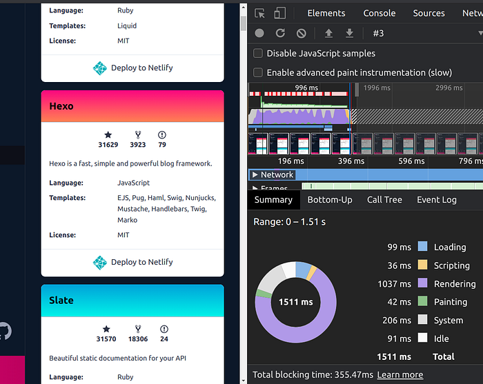
Let's consider the following page that contains many cards with different info. While about 12 cards fit the screen, there are approximately 375 cards in the list. As you can see, the browser has taken 1037ms to render this page.
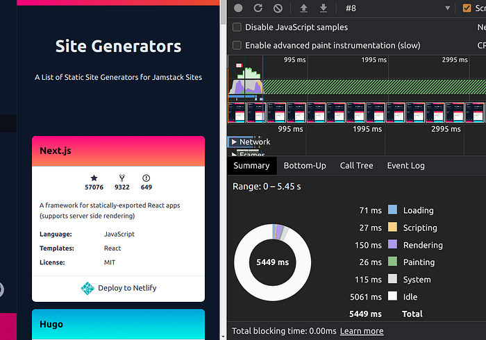
As the next step, you can add content-visibility to all cards. (In this example, after adding content-visibility to the page, rendering time dropped to 150ms. That's more than 6x performance improvement.)
Limitations of `content-visibility`
- This feature is still experimental. As of this moment (28 December 2020), Firefox (PC and Android versions), Internet Explorer (I don’t think they have plans to add this to IE) and, Safari (Mac and iOS) do not support content-visibility.
- Issues related to scroll-bar behavior. Since elements are initially rendered with 0px height, whenever you scroll down, these elements come into the screen. The actual content will be rendered, and the height of the element will be updated accordingly. This will make the scroll bar to behavior in an unintended manner.
To fix the scroll bar issue, you can use another CSS property called contain-intrinsic-size. It specifies the natural size of an element. Therefore the element will be rendered with the given height instead of 0px.
.element {
  content-visibility: auto;
  contain-intrinsic-size: 200px;
}
However, while experimenting, I noticed that even with containt-intrinsic-size, if we are having a large number of elements with content-visibility set to auto you will still have smaller scroll bar issues.
Therefore, my recommendation is to plan your layout, decompose it into a few sections and then use content-visibility on those sections for better scrollbar behavior.
`Will-change` property
Animations on the browser aren’t a new thing. Usually, these animations are rendered regularly with other elements. However, browsers can now use GPU to optimize some of these animation operations.
With will-change CSS property, we can indicate that the element will modify specific properties and let the browser perform necessary optimizations beforehand.
What happens underneath is that the browser will create a separate layer for the element. After that, it delegates the rendering of that element to the GPU along with other optimizations. This will result in a smoother animation as GPU acceleration take over the rendering of the animation.
Consider the following CSS class:
.animating-element {
  will-change: opacity;
}
<div class="animating-elememt">Animating Child elements</div>
When rendering the above snippet in the browser, it will recognize the will-change property and optimize future opacity-related changes.
According to a performance benchmark done by Maximillian Laumeister, he has obtained over 120FPS rendering speed with this one-line change, which initially was at roughly 50FPS.
When not to use will-change
While will-change is intended to improve performance, it also can degrade web app performance if you misuse it.
- Using
will-changeindicates that the element will change in the future. So if you try to usewill-changealong with an animation simultaneously, it will not give you the optimization. Therefore, it is recommended to use will-change on the parent element and the animation on the child element.
.my-class {
  will-change: opacity;
}
.child-class {
  transition: opacity 1s ease-in-out;
}
Do not use elements that are not animating.
When you use will-change on an element, the browser will try to optimize it by moving the element into a new layer and handing over the transformation to the GPU. If you have nothing to transform, it will result in a waste of resources.
One last thing to keep in mind is that it is advisable to remove will-change from an element after completing all the animations.
Reducing the Render-blocking time
Today, many web apps must cater to many form factors, including PCs, Tablets, & Mobile Phones, etc. To accomplish this responsive nature, we must write new styles according to the media sizes. When it comes to the page rendering, it cannot start the rendering phase until the CSS Object Model (CSSOM) is ready. Depending on your web application, you may have a large stylesheet that caters to all device form factors.
However, suppose we split it up into multiple stylesheets depending on the form factor. In that case, we can let only the main CSS file block the critical path and have it downloaded as a high priority and let other stylesheets download in a low priority manner.
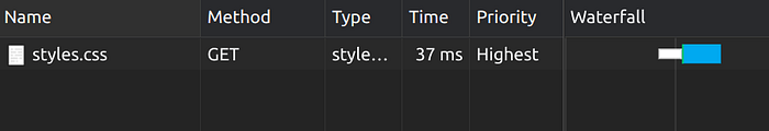
<link rel="stylesheet" href="styles.css" />
After decomposing it to multiple stylesheets:
<!-- style.css contains only the minimal styles needed for the page rendering -->
<link rel="stylesheet" href="styles.css" media="all" />
<!-- Following stylesheets have only the styles necessary for the form factor -->
<link rel="stylesheet" href="sm.css" media="(min-width: 20em)" /><link
  rel="stylesheet"
  href="md.css"
  media="(min-width: 64em)"
/><link rel="stylesheet" href="lg.css" media="(min-width: 90em)" /><link
  rel="stylesheet"
  href="ex.css"
  media="(min-width: 120em)"
/><link rel="stylesheet" href="print.css" media="print" />
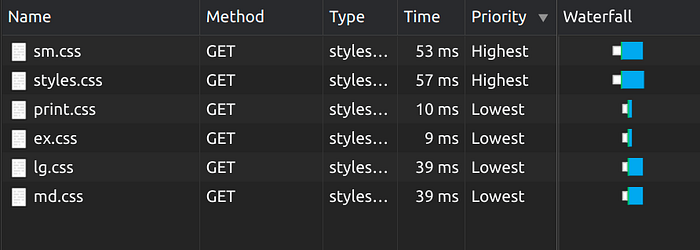
As you can see, having stylesheets decomposed according to form factors can reduce the render-blocking time.
Avoiding `@import` to include multiple stylesheets
With @import, we can include a stylesheet in another stylesheet. When we are working on a large project, having @import makes the code cleaner.
The critical fact about @import is that it is a blocking call as it has to make a network request to fetch the file, parse it, and include it in the stylesheet. If we have nested @import within stylesheets, it will hinder the rendering performance.
/* style.css */
@import url('windows.css');

/* windows.css */
@import url('componenets.css');
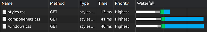
Instead of using @import we can achieve the same with much better performance by having multiple links as it allows us to load stylesheets in parallel.
References
- Selbekk, Kristofer. "New media queries you need to know" LogRocket, 26-02-2020, https://blog.logrocket.com/
- Hapuarachchi, Rumesh Eranga "Improve Page Rendering Speed Using Only CSS", 09-12-2020, https://blog.bitsrc.io/